Thursday, 17 July 2014

Kitchen refurbishment in Balham, SW12

I recently had the pleasure of undertaking the refurbishment and interior design of a kitchen in Balham.
Before Picture
The kitchen space is lovely, and the roof space has been opened up to expose the slope of the ceiling and, whilst it can't be seen from my initial picture, there is a great gallery area above the kitchen which my client uses as her office space.

We generally left the layout of the new kitchen as per the old. The layout works for her, so we didn't see any need to change it.

Anyway, without further ado - here's the new kitchen.


The walls have been painted in Farrow and Ball Parma Grey and Elephants Breath. These blend well with the light flooding into the room and create a sophisticated feel to the overall design. 
The kitchen is a Rotpunkt, great german design. 
Previous halogen tracked lighting has been replaced by long lasting LEDs to provide great task lighting and decorative lighting in the form of pendant lights from my favourite lighting company, Rothschild and Bickers (Pick n Mix product) add contrast and interest to the room and help accentuate the opening up of the roof space. 
The flooring is Nordic White Oak by Polyflor. 

The kitchen has now been opened up and the circular window is now a feature of the room. Overall, this kitchen design is so fresh and cool and it was a pleasure working with the client. 


Sunday, 13 July 2014

Design Board - Retro Industrial Chic


I thought I'd share with you my latest design proposal for one of my clients here in London. I'm designing the kitchen and lounge space.
My client is a single male in his 40s who lives in a Victorian maisonette.
The lounge space is a reasonable size (at London standards) at 14sqm.
He is wall mounting his TV above the fireplace and having some bespoke shelving built into one of the alcoves. Here is my design for his alcove shelving.


The kitchen design is not shown here, but he has a small galley kitchen and the units chosen are a Rotpunkt kitchen in Matt Kashmir.

Here's the style of design I'm going for in the lounge area. Do you think it's a good style for a single man? I didn't want anything too masculine.


The 3 lights on the left of the picture will hang above the breakfast bar.
Some colour co-ordinated ornaments will adorn the new bespoke shelving.

So if he likes this style, the next step is to do the room plan to ensure it'll all fit and identify some extras, e.g rug, table lamp, etc

Check out my pinterest board which will link to the source information for each item in the scheme.
http://uk.pinterest.com/janeyfitch/earlsfield-kitchen/. It's changing all the time. Grateful for any feedback.


Saturday, 5 July 2014

Kitchen worktops – the thick or thin of it.

I’m currently designing a kitchen and lounge area and after much debate my client has chosen a contemporary kitchen with a slimline stainless steel trim handle, integrated appliances, an undermounted sink and a small breakfast bar area. He has also chosen a quartz material for the worktop.

The next decision he has to make is what worktop thickness should he go for? Thick or thin?

For years, the standard worktop thickness has been 2-3cm. But more recently, homeowners are looking to put a trendy spin on their worktop and are deviating from the norm. Whether it be really thick or super thin? Which way to go?

At the thin end of the debate, super skinny worktops as thin as 1cm are making a splash in the contemporary market. It has to be noted our European counterparts have been enjoying slim profiled worktops for a while, but will they stand the test of time? Or are they a trendy fad that will look dated 5 years down the line?
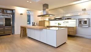
how thin is this worktop from Bulthaup?


Thin and contemporary, they provide a sleek and modern look that works well with today’s integrated kitchen. With its streamlined look, subtlety is the key.

However, an extra thick worktop adds a unique personality to a kitchen. Some feel that the extra thickness translates to an impression of higher quality and greater expense. So is it affordable within the budget?
itkitchens.com


The thin and thick debate will obviously impact the budget. Kitchen renovations are never cheap but arguably the worktop decision, which provides the icing on the cake for a kitchen design can make or break the final look. There is no point spending an arm and a leg on an expensive kitchen and then trying to keep costs low on the worktop as it will ruin the whole look.

Mixing and Matching


What about teaming up super skinny with big and bold to make a real statement or mixing materials as well as thickness?
Bulthaup kitchens


Using different thicknesses will add interest and texture to schemes and prevent the look from being overpowered by one material.
Mixing materials may also potentially help to reduce the cost of worktops. For example, granite is a premium material that comes with a premium price, so introducing areas in timber will not only make a feature in the scheme but may also be more affordable

And the decision is?


Let me know if you want to see what we went with in the end?

Tuesday, 1 July 2014

How to make a small bathroom look HUGE!

Oooh! What a dilemma. Is there anything you can do to make a small bathroom look really big.

Yes - use Magic.

But if you don't believe in magic, then there is always ILLUSION (a neat little trick used by Interior Designers and magicians of course).

Take this, rather grotty bathroom in my friends newly purchased flat.


Current Features:

  • It had reduced head height due to the staircase protruding into it. 
  • A sunken bath, which doesn't feel very luxurious
  • Florescent light, glaring in your face as you enter the room
  • No natural light
  • It doesn't have much going for it does it?
  • Fortunately, you can't see the floor! 

What we did:

  • We dropped the floor, thereby increasing the head height available
  • We discarded the bath. The rational was that it wasn't really a flat for a small family therefore a bath is not really needed. 
  • We built a stud wall to hide the shower pipes and toilet cistern
  • We added 3 layers of lighting
    • mirror
    • ceiling downlights
    • small LED plinth lights around the skirting level
  • We used a single colour tile, which is a white metro with dark grey grout
  • We used a small cloakroom sink in the corner
  • We hung the door so that it opened into the hallway, rather than the bathroom. 
  • Used a wall hung toilet to create an illusion of greater floor space


New bathroom
I think the results speak for themselves. The illusion has worked. The room looks larger and more spacious and is welcoming now.
Finish touches would be to add some accessories around the mirror. Maybe a strong green from a shade loving plant, or some coloured bottles at different heights.